Your Cart is Empty

Bucketty’s has a new look!
To celebrate our brewery dreams rising from the ashes at our new home in Brookvale, we’ve re-branded to better reflect our beers, the new venue and what we’re about.
A small preamble before you scroll down and see the new logo and branding (you probably already have… slow down would ya.)
The thing about Bucketty is the way you feel when you’re there. The bush, the slowness, the connection with nature and those around you. It’s different and wonderful in so many ways, which is the reason why we originally decided to put a brewery there.
But with the Bucketty venue on ice for the time being thanks to Cessnock Council, we figured it was important to develop a look and a feel that reminds us of what it means to be connected to the bush and this part of the world even though we’ll be at a warehouse in the heart of Brookvale.
Back 200 years ago the Brookvale site was flanked by mighty eucalypt’s and had a stream running close by, so in some ways it’s a throw back to the distant past while also paying homage to what Bucketty is in it’s current day.
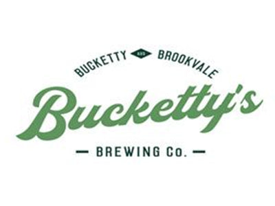
Hours and hours of thought and design went into our new look. Kelly and Gary from ExtraBlack even made the 3hr round trip to Bucketty and really immersed themselves in the essence of the place.
They really were all-in with us and we couldn’t be happier with the end result:
But it’s not just a logo, there’s a whole package. Running through the brand is simplicity, connection to nature and those around us. When you’re drinking our beer, or hanging in the tap room, it’s all about getting yourself…

The can designs also look pretty sick.
A simple silver can with black writing featuring a gumleaf motif, wrapped with a horse-shoe label identifying the beer style
The 24 can case will be a simple black and natural colour, with the style of the beer labelled on the side.
The creative process is funny, because everyone has an opinion. Some love it, some kinda like it and some absolutely hate it. If you’re in the latter category, it’s all good. Wait until you taste what’s inside before making judgement, you uncultured swine… not really, thanks for caring and reading this post. Seriously, it’s very kind of you to take an interest in our arty farty logo and can design.
Now, back to the point – What we don’t want is for everyone to be like “hmm oh yeah, pretty nice”. We’re looking for a polarising effect, some will love it, some won’t, but most will remember and recognise the brand.
To give you an idea of what we mean – If you stare too long at any craft beer fridge you’re risking an epileptic fit. Every can screams for attention with colours, shapes, weird images and wacky names. That’s not us. We’re not trying to stand out to the promiscuous, bearded craft beer nerd. We’re trying to get your attention, our loyal fans. So when you see us in the corner of the fridge, next to the Stronghold DoubleDecker IPA in a magenta can with pop orange text I just made that up, you’ll reach for us. Cause you’ve already wrapped your lips around one of our beers and know the quality of what’s inside. What’s more, you think we’re pretty cool, which is exactly what we think about you too btw.
Now we’re in the process of rebuilding the website with the new branding and hope to be rolling that out with news about our soon to be approved DA (fingers crossed!). After 7 months the council have finally approved our numerous reports, and we’re expecting the green light in the coming week. WOOP!
As always, stay tuned!
Cheers
Nick & Lexi


